Using the Date Component in React Native
React Native also offers the convenience of running both iOS and Android with a single code. Of course, sometimes native platform intervention is necessary. Today, I'd like to introduce a component for date selection in React Native. While explaining the component, I'll also touch on the features of the library I'm using. First, to integrate the library into our project, we need to include the following. You can also find the library's npm page here. It can be confused with other libraries with the same name.
npm i react-native-calendars
We can import it into our project as follows.
import { Calendar, LocaleConfig } from "react-native-calendars";
After importing the relevant library into our project, we can start using it. Below is a sample code example. It's quite simple to use, and the code snippets below primarily focus on styling. You can style the date however you like by assigning the styling options to the theme properties.
<Calendar
    key={`${colors.primary_500}-${colors.neutrals_50}`}
    firstDay={1} // Haftanın ilk günü Pazartesi
    onDayPress={handleDayPress}
    markedDates={{
        [tempSelectedDate]: {
            selected: true,
            selectedColor: colors.primary_500,
        },
    }}
    style={styles.calendar}
    theme={{
        backgroundColor: colors.neutrals_50,
        calendarBackground: colors.neutrals_50,
        textSectionTitleColor: colors.neutrals_600,
        textSectionTitleDisabledColor: colors.neutrals_400,
        selectedDayBackgroundColor: colors.primary_500,
        selectedDayTextColor: colors.neutrals_50,
        todayTextColor: colors.primary_500,
        dayTextColor: colors.neutrals_950,
        textDisabledColor: colors.neutrals_400,
        dotColor: colors.primary_500,
        selectedDotColor: colors.neutrals_50,
        arrowColor: colors.primary_500,
        disabledArrowColor: colors.neutrals_400,
        monthTextColor: colors.neutrals_950,
        indicatorColor: colors.primary_500,
        textDayFontWeight: "400",
        textMonthFontWeight: "600",
        textDayHeaderFontWeight: "500",
        textDayFontSize: 16,
        textMonthFontSize: 18,
        textDayHeaderFontSize: 14,
    }}
/>
The default is English. If you want it to appear in Turkish, the following code snippet should be added to the top of our file. I've set the calendar to Turkish as an example. By specifying the long and short versions of months and days accordingly, we avoid design issues.
LocaleConfig.locales[`tr`] = {
    monthNames: [
        "Ocak", "Şubat", "Mart", "Nisan", "Mayıs", "Haziran",
        "Temmuz", "Ağustos", "Eylül", "Ekim", "Kasım", "Aralık"
    ],
    monthNamesShort: [
        "Oca", "Şub", "Mar", "Nis", "May", "Haz",
        "Tem", "Ağu", "Eyl", "Eki", "Kas", "Ara"
    ],
    dayNames: [
        "Pazar", "Pazartesi", "Salı", "Çarşamba",
        "Perşembe", "Cuma", "Cumartesi"
    ],
    dayNamesShort: ["Paz", "Pts", "Sal", "Çar", "Per", "Cum", "Cmt"],
    today: "Bugün"
};
LocaleConfig.defaultLocale = "tr";
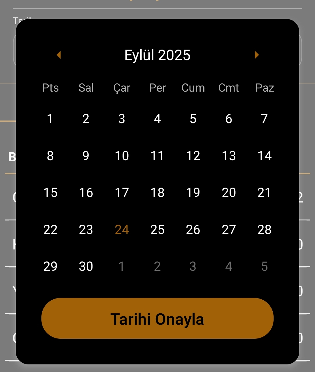
You can use the library this way and develop it into a component for your own application. The date component we're talking about is as follows. The screenshot is shown below.